Fruit with benefits. A cult snack in the making.

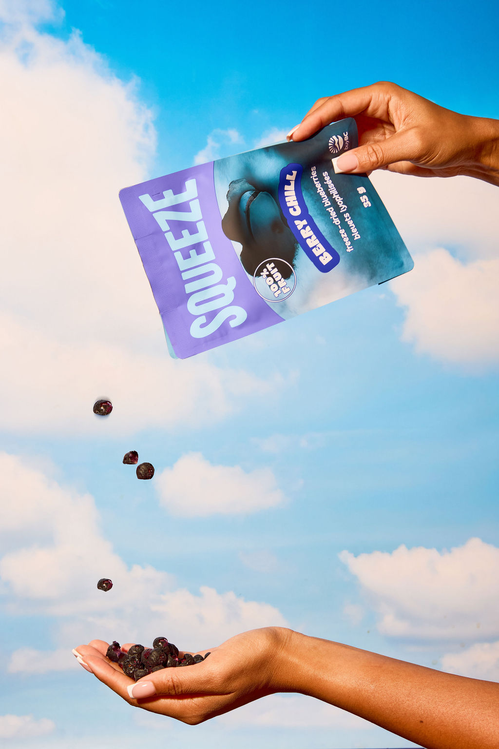
Squeeze came to us with salmon-toned packaging that looked the same across every flavour SKU. They were muted, repetitive, and easy to miss on shelf. The product itself was vibrant and craveable, but the branding wasn’t keeping up.

We elevated Squeeze with a full rebrand using bold, fruit-coded colours, a logo wordmark that quite literally got squeezed, and a cheeky new voice that makes healthy snacking feel flirty, loud, and fun. Each SKU now has its own personality, the packaging system doesn’t just stand out — it shouts — and the retro-inspired photography layers in even more attitude.

From gift baskets to grocery carts, this rebrand gave Squeeze the shelf presence and personality it needed to scale. We turned a soft pouch into a brand with main-character energy.

And now? She’s ready for her close-up. Get Squeeze into your shop at squeezegoods.com.


Project Type

Rebrand


Category

Food


Services

Brand Identity Refresh
Packaging Redesign
Tone of Voice & Messaging
Product NamingPhotography Direction


Brand Strategy

Snack with a storyline.

In our brand strategy workshop, we uncovered that Squeeze wasn’t just “freeze-dried fruit” — she needed to lean into the personality of each flavour and claim her shelf power. The strategy was clear: evolve from “cute but forgettable” into a bold, cheeky brand built for moms, wellness girlies, and snack lovers who crave flavour with attitude. We mapped customer archetypes, crafted fruit-coded personalities for every SKU, and gave the brand a flirty, unapologetic voice loud enough to own the snack aisle. This foundation became the backbone of the rebrand — transforming Squeeze into a cult-worthy snack with true retail presence.

The Big Idea

FRUIT WITH BENEFITS /

FRUIT WITH BENEFITS /

More Work

Shoot your shot

Shoot your shot

Start Your Project

© COPYRIGHT 2025 CORE CREATES INC. ALL RIGHTS RESERVED.

Privacy Preference Center